Please wait...

WHY IT IS TIME TO USE THE PERCEPTUAL RENDERING INTENT FOR IMAGE CONVERSIONS

BPC = Best possible compromise? 

This article will (hopefully) convince the majority of the printing industry that the usage of the perceptual rendering intent should be the default choice for conversions of images from one gamut (e.g. Adobe RGB) to another (e.g. FOGRA51).

At first we introduce some basics about gamut mapping. This leads to the four rendering intents (RI) defined by the ICC which are briefly explained. Afterwards the reason for the current popularity of the non-ICC rendering intent „relative colorimetric with black point compensation“ (rel.col. bpc) is explained. The last part will explain why today’s gamut mapping algorithms along with the restrictions of the ICC relative colorimetric intent lead to the suggestion to switch to perceptual as default rendering intent for photographic image content.

1. GAMUT MAPPING

Output devices have limitations in terms of its capabilities to reproduce color. A simple example is a black&white printer. If a color image has to be printed on such a printer it needs to be changed in a way that it can still be recognized as that image. Methods to calculate these changes are called „Gamut Mapping“.

The adjustments that are necessary for the complete gamut can be separated into components. This is useful to understand the necessary compromises that a user has to expect.

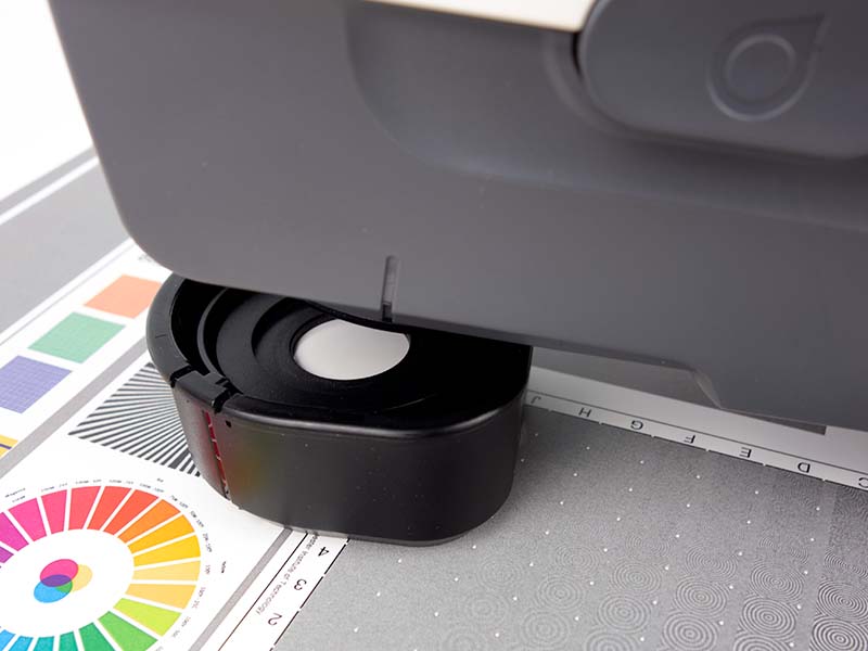
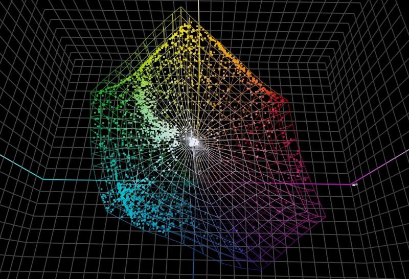
In color science the distance from the neutral axis is called chroma. The more „vivid“ a color  the higher its chroma. If a printer cannot reproduce the vivid red of a rose in an image the chroma has to be „compressed“ to a point that the printer can reproduce.

The lightness axis is the range between the lightest and the darkest point. Printing systems that are printing on a quite dark substrate and cannot create very dark blacks (think of newspapers) have a limited dynamic range. The adjustment of an image to this dynamic range is called lightness mapping.

The „hue“ could be called the „base-name“ of a color. All colors within a certain hue range in the color circle will be called „red“. One primary goal of gamut mapping is to preserve the hue of a source color as much as possible during reproduction.

2. RENDERING INTENTS

Practical gamut mapping algorithms use a mix of Chroma-, Lightness and Hue-Mapping in order to achieve certain compromises. A typical compromise could be that a color needs to be printed much darker in order to keep its hue. Or certain colors will be printed lighter in order to keep the contrast between them. The compromises that are chosen depend on the intent of the user who wants to reproduce the image or in other words the users „rendering intent“.

The ICC defines four rendering intents to convert from one gamut to another gamut. These are:

  • Perceptual
  • Saturation
  • Relative colorimetric
  • Absolute Colorimetric

This is the rendering intent that was defined to be used to convert photographic image content from one gamut to another while preserving the overall appearance of an image. Basically this means that contrast preservation is preferred over colorimetric accuracy.

This is the rendering intent that was defined to be used to convert graphics from one gamut to another while preserving the vividness or saturation of the original as best as possible. Basically this means that neither contrast preservation nor colorimetric accuracy is important.

This is the rendering intent that was defined to be used to preserve the colour values of the original as much as possible ignoring any white point difference. Basically this means that contrast preservation is of secondary importance. Colours that are out of gamut have to be clipped to the gamut boundary.

This is the rendering intent that was defined to be used to preserve the colour values of the original as much as possible incorporating any white point difference. Basically this means that the goal is to get no colour difference between source and destination. It is usually used for proofing purposes.

2.1 RELATIVE COLORIMETRIC WITH BLACK POINT COMPENSATION

Todays workflows in the printing industry are often configured to use an extension of the ICC rendering intents which was originally implemented by Adobe®. It is known as Black Point Compensation or BPC. In the authors opinion the reason for its popularity lies in the history of gamut mapping algorithms.

Gamut mapping has been implemented into imaging systems long before the ICC was founded. Analogue originals were scanned with drum scanners and transferred to film and later digital data. These analogue originals had a very large dynamic range that had to be compressed to the much lower dynamic range of a printing process. When the ICC was established, vendors adopted these very strong compressions into the look up tables for their profiles. But when ICC technology became popular the image content was already created using flatbed scanners and digital cameras with a more limited dynamic range. Thus the compression in the perceptual tables was too strong leading to a big difference between the original image and the mapped representation. Alternatively people tried to use the relative colorimetric intent. But due to the fact that all out-of-gamut colors are clipped to the gamut boundary the contrast especially in the dark areas of images got completely lost. A solution was implemented by Adobe® and called „black point compensation“. This method compresses the source gamut into the destination gamut based on the black point differences. As a result the original image appearance seems to be preserved.

LIMITATIONS OF BPC

Like most technologies BPC has its limitations. It does not take care of possible necessary compression in chromatic areas. As a result it is well possible to lose too much contrast in vivid image areas. Another important limitation comes from the ICC specification. For relative colorimetric it is defined that the grey axis has to be mapped relative to the destination gamuts white point. Talking about printing this means to the papers white point. This specification makes BPC becoming very dissatisfying for many users with the growing number of papers with a huge amount of optical brighteners. These papers have a bluish to pinkish appearance. Many people call it „cold“. In case images are converted for such a paper also the grey axis becomes very bluish or „cold“. This also means that there is a huge difference between prints even if the gamut size is very similar.

The following image shows a typical issue that people run into today. Left: CMYK image prepared for a paper with a neutral whitepoint Bottom-right: Same picture prepared for a paper with a bluish whitepoint using relative colorimetric with bpc Top-right: Same picture prepared for a paper with a bluish whitepoint using the MYIROtools setting  „Neutralize OBA“ and perceptual gamut mapping.

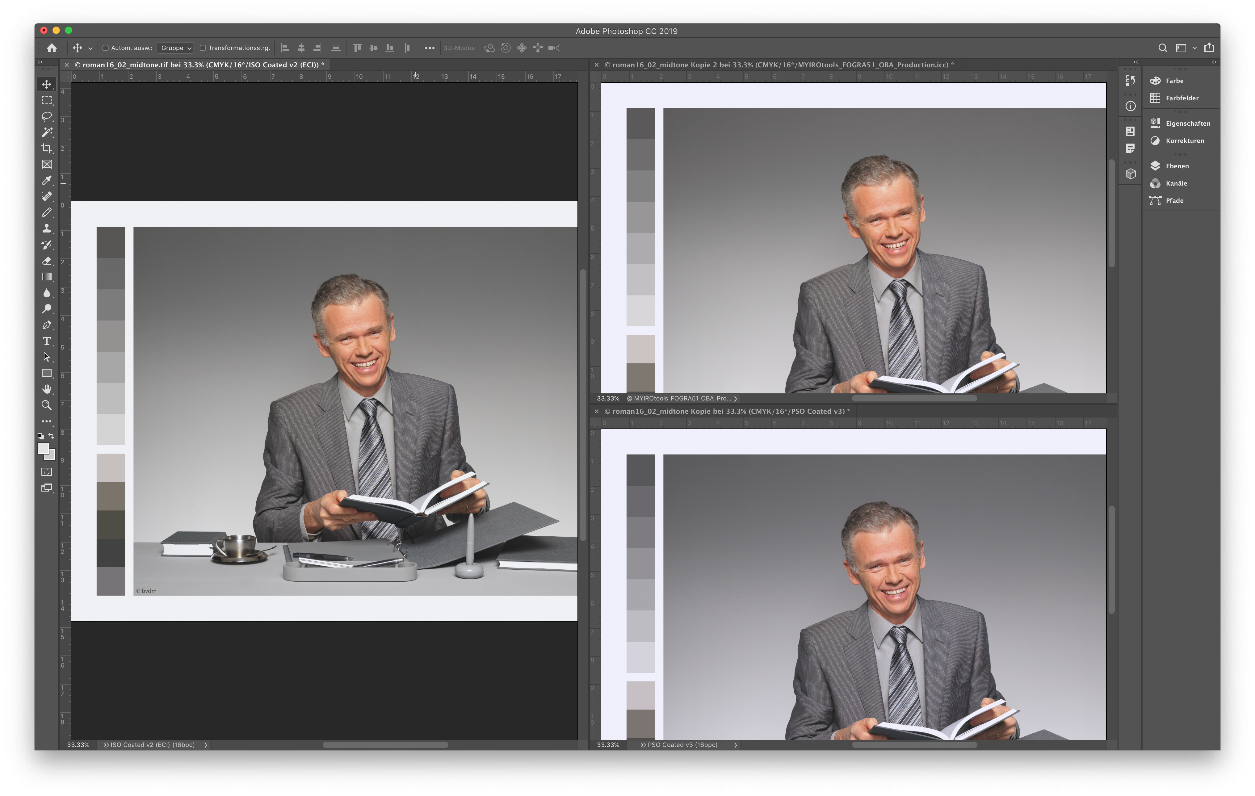
It can be seen that the grey axis as well as the skin tones of the image in the top-right corner corresponds very well to the „reference“ on the left. The image in the bottom-right corner has a completely different mood due to the paper-relative gamut mapping that is required by ICC relative colorimetric rendering.


3. PERCEPTUALS REVENGE

Unlike relative colorimetric the perceptual rendering intent can be freely defined by the developers of the ICC Profiling Engine. Thus it is very much possible to implement a gamut mapping which preserves the original images grey axis much better than BPC is allowed to do. Also the algorithms have evolved a lot over time and are optimized for the dynamic range of todays images (the author ignores HDR content for this article). Users should rethink existing workflows and try a perceptual rendering intent offered by modern ICC Profiling Engines like the MYIROtools Profiler. It keeps the original image appearance also in chromatic areas and is able to keep a neutral grey axis even on colored substrates.

And to answer the original question:

BPC ≠ Best Possible Compromise

BPC = Bad Perceptual Cheat

IS RELATIVE COLORIMETRIC OBSOLETE?

In print production there are usually two conversions with gamut mapping involved. The first gamut difference between original photo and an exchange space (like FOGRA51) is usually big and users should prefer the perceptual rendering intent.

When it comes to printing this content a relative colorimetric conversion to the real printing conditions gamut is usually a good choice.
The reason for this is the fact that the gamut difference is usually small and does not need compression anymore.

In cases where the production paper has a very different white point compared to the exchange space a perceptual mapping is again superior.

What a better proof of performance than a real testing with your own files?

We do now offer an online testing of our Neutralize OBA settings, please follow the link below to benefit from it !