Why does MYIROtools offer its own profiling charts instead of simply using layouts like IT8/7.4 or similar?
Basically, a chart that we use to finally create an ICC profile shouldn't be called a "profiling chart", but a "characterization chart".
It's purpose is to get information about the behavior of an output process; in other words, to characterize the process.
That is, the correlation between the printed CMYK (or RGB or CMYKOGV, etc.) value and the resulting color.
Simply put, an ICC profile is a file and/or data format for storing this characteristic.
The most accurate characterization would have entries for all input values (16.7 million for an RGB device).
People familiar with ICC profiling know that no characterization table has millions of patches.
Also, the number of entries in an ICC profile is limited to ensure efficiency in terms of memory and processing speed.
Therefore, it is quite possible to limit the number of patches to be measured.
But how do we decide which patches we need to measure?
“Everything should be made as simple as possible, but no simpler.”
We want an accurate characterization of the output process with as little information as possible.
Technically, this means that any printed color that we can predict by interpolation does not need to be measured.
A simple example is an old-school CRT monitor. Knowing the color of white and 100% red, it is very easy to predict the color of 50% red. This is because of the near perfect linearity of the cathode ray tube.
In a printing process, this is typically true for primary ramps (e.g., 0%....100% Cyan) because a single ink is fairly predictable.
On the other hand, the more ink we apply to a substrate, the less predictable the result.
In addition, certain printing processes or technologies behave differently in terms of predictability.
Conclusion:
To get an accurate characterization of an output process, it is necessary to optimize the measurement points to reflect the nonlinearities of that process. Plots described in ISO standards such as IT8/7.4 etc. are good for checking the accuracy of an output process. But they are not optimized to characterize a specific printing process.
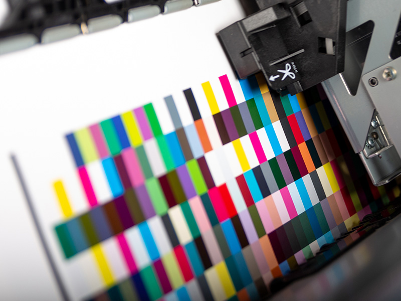
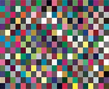
MYIROtools offers three different "standard" chart sizes. The smaller charts are subsets of the larger ones. All are optimized to get information in areas of the color gamut where typical printing processes behave unpredictably.
An additional criterion to consider when designing characterization charts is the algorithm of the profiling engine, especially for multicolor charts. The MYIROtools charts are of course optimized for the MYIROtools engine.
How do I decide which chart I should use?
The question technically means: How many patches are enough to characterize my process?
You can test this yourself.
- Create a profile using the 420-patches chart (1)
- Print and measure the bigger chart
- Use MYIROtools Analyze and its feature "Easy Compare"
- Select the measurement of the small chart
- Load the ICC Profile from 1) as reference.
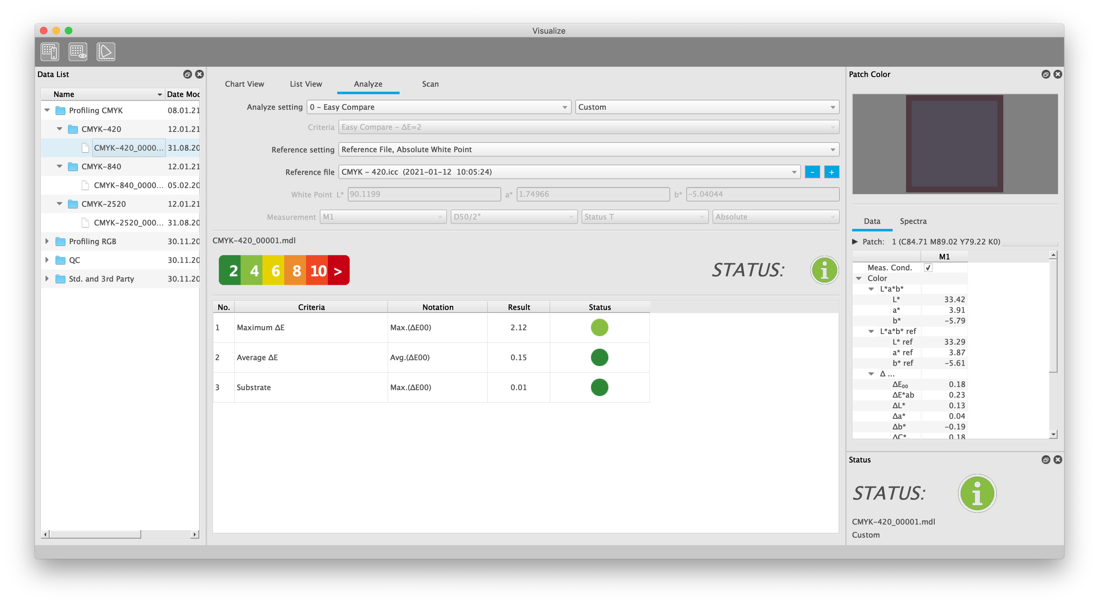
- Note the resulting color differences (6)
- Select the measurement of the bigger chart
- Load the ICC Profile from 1) as reference
- Check the resulting color differences and compare them against 6)
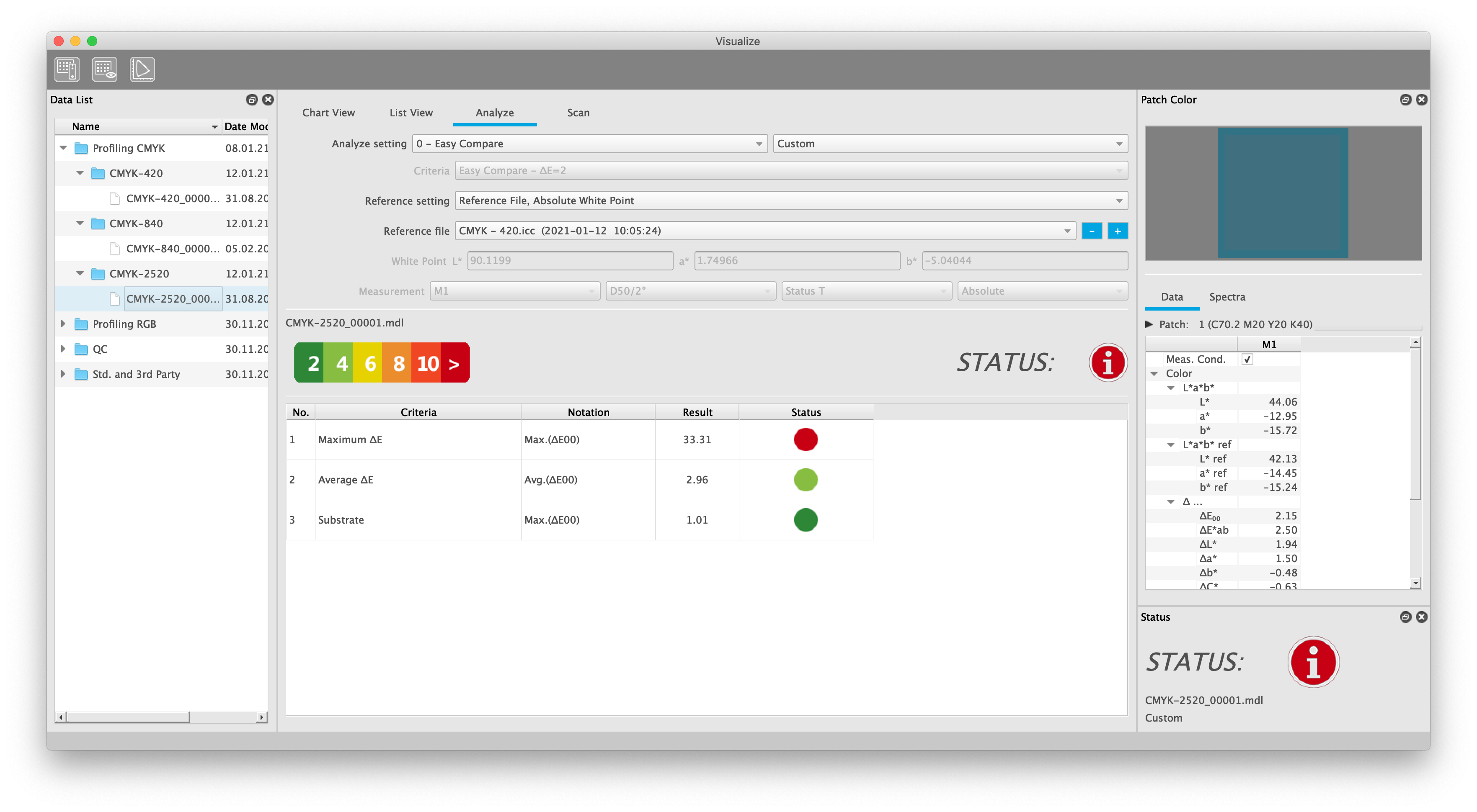
In case the color differences from step 9) are much bigger than the differences from 6) there is a good chance that your profile does not describe your printing process accurately enough. Make a profile with more patches and check again.
Please note that it could also be that your printer is unstable or prints non-uniform. This will cause a color difference between the prints from steps 1) and 2) already.