In order to find alternatives to Pantone we might want to remember what Pantone is and what it is not.
A Pantone number basically represented an ink recipe. You might know that in every Pantone fandeck you can find the Pantone base colors. In fact these aren't base colors but base inks. These are the inks that are the ingredients to formulate all the other inks having all the other numbers. That means that a Pantone number is not a color definition but more like an order code for a can of printing ink.
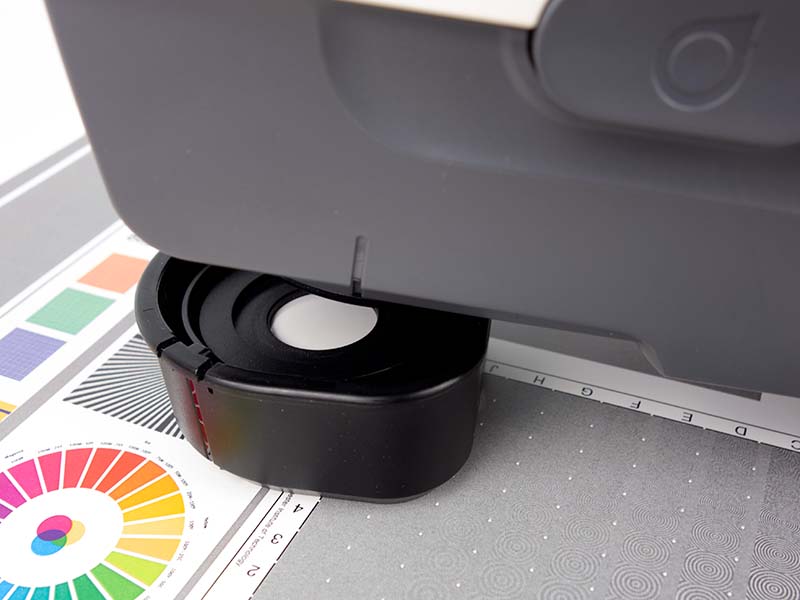
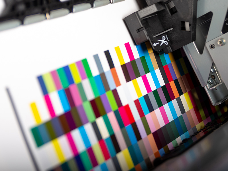
As humans in general and designers in particular need visualizations we can spend money to buy a test print of all these order codes in one fan. But that still doesn't make a color definition or a color standard. They are printed on only one paper of a type and they vary from fan to fan. These fans should give us an idea how a certain ink might look like if it is used for a printed product.
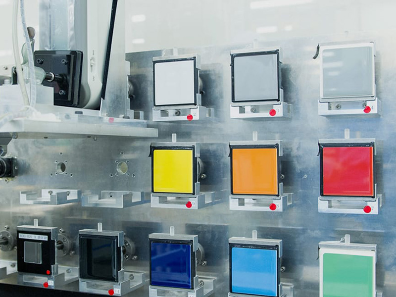
When a print house or ink manufacturer gets the order code they'd basically look up the recipe in their formulation software and produce the ink. The resulting color will depend on the final substrate as well as printing technology, ink film thickness etc.
A Pantone number is neither a color definition nor a color standard.
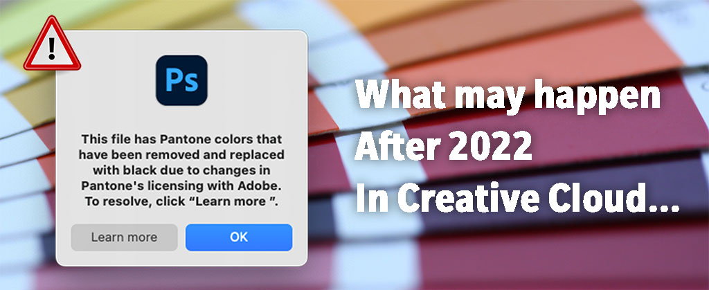
So we needn't be too sad that we cannot access the ink order codes in Adobe apps anymore.
Eddy Hagen from insights4print.ceo created "A Better Brand Color Guide". It is an easy to understand tutorial how to define a color in a way that assures color consistency. It also includes guidance how to communicate color from design to production. All without using the big P.
We are proud to be allowed to make it available for download on the MYIRO website and volunteered to translate it into other languages.
We highly encourage you to read it completely from end to end.